EIS Plotting: Nyquist and Bode Visualization
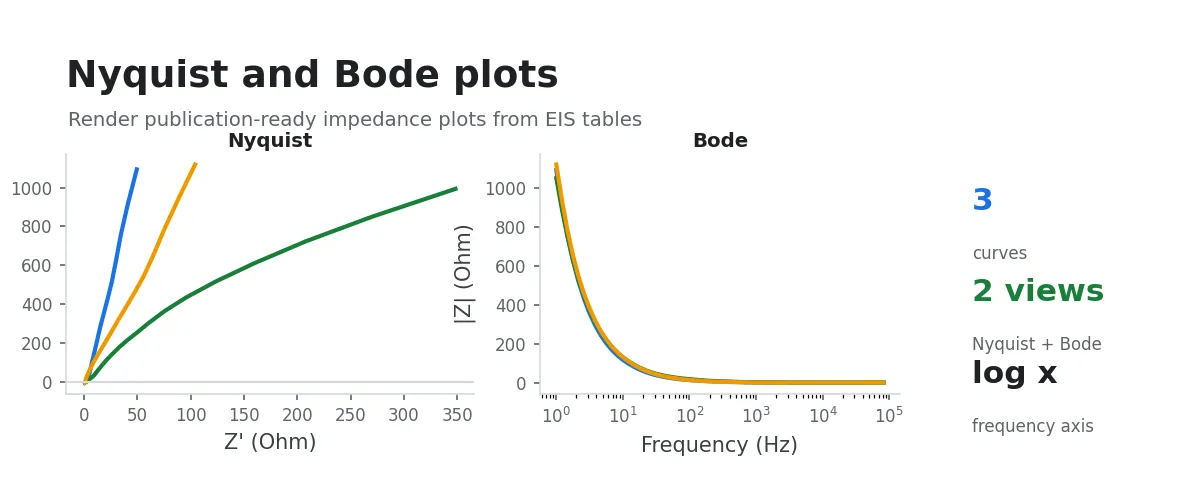
After an EIS measurement, the natural first step is to plot the curves and assess the data quality.
This workflow batch-plots EIS data as Nyquist and Bode diagrams, letting you quickly spot sample differences, outliers, and measurement stability. It also exports an Origin project file so you can refine and publish figures later.
Input Data
Select a folder containing instrument-exported raw EIS data, or multi-select a group of raw EIS data files. Common text, CSV, Excel, EC-Lab .mpr, Gamry .dta, and VersaStudio .par files are recognized automatically.
Procedure
- Select input data: choose an EIS data folder, or multi-select a group of files from the same experiment.
- The system automatically detects analyzable EIS data and batch-plots it.
- Output files are saved in the selected data folder; once processing is complete you can view images and project files directly.
What Gets Generated
1) Nyquist Plot
- x-axis:
- y-axis:
- Useful for observing charge-transfer impedance, diffusion behavior, and the overall shape before equivalent-circuit fitting
2) Bode Plot
- Magnitude plot: vs. frequency (log scale)
- Phase plot: Phase vs. frequency (log scale)
- Convenient for comparing response mechanisms across different frequency ranges
Output
Each sample produces:
*_nyquist_matplotlib.png*_bode_matplotlib.png*_eis_plots.opju(single-sample Origin project)
In addition, a merged file is generated:
eis_plots_merged.opju(multi-sample merged Origin project)
Subsequent Analysis
- EIS/DRT Analysis: Mapping Frequency-Domain Impedance to a Distribution of Relaxation Times: inspect the relaxation time distribution for the same EIS dataset